How To Easily Add A Gradient Background
Pin this post to Pinterest! ☝🏻
GRADIENTS
Gradient backgrounds are making a come back!
They're a great way to bring a unique design element to your site and add some pizzazz to a rather boring and flat background color. They're both eye-catching and attention-grabbing.
Squarespace offers a few different options for backgrounds which include an image, video, art, or a solid color….but not gradients! The good news is we can easily create this look with just a little bit of code (keep reading!).
Gradients are very easy to do and will take your design to a whole other level.
PRO TIP: Of course, you could always just create an IMAGE of a gradient and upload it as a background image, but images tend to slow sites down, so it's better to use CSS to create it (plus it’s more versatile!).
WHAT IS A GRADIENT?
Gradients are a gradual transition between similar or contrasting colors. There are 2 main types of gradients:
Linear: Transitions from top to bottom or left to right
Radial: Starts in the middle and transitions out
They’re trending more and more these days, especially when it comes to logos. Every one of these logos uses a gradient:

If you look at how those logos have evolved over the years, all of them were previously multi-colored with sharp edges between each color. Now they're all using gradients to transition between the colors.
So, what does it say when four huge companies in technology are using gradients?
That gradients are on point.
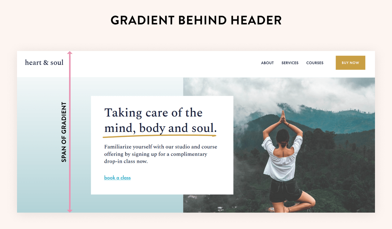
DESIGN #1
Here's my favorite example of a gradient. This is the hero section of the home page and the gradient fades into the top header for a seamless transition.
The blue in the gradient was chosen from the blue in the image, plus the gold color is a good accent for the button and underline.

Here's how to achieve this look -
STEP 1: Create your text/image layout for the hero section.
STEP 2: Set the background color for the header navigation. For this example, mine is white.
Hover over the header and click Edit Site Header. Click Style. From here you can click the drop down (where mine says Solid) and it will give you different options for the header. The settings that you choose will be the settings for the header on ALL pages.

STEP 3: Copy this code and paste it in Website -> Website Tools -> Custom CSS
*I’ll show how to change the color of the gradient in the “How to choose your gradient colors” section below.
//background gradient color for hero section//
section[data-section-id="64ac195b0b1e87163be9591e"]
.section-background {
  background-image: linear-gradient(0deg, hsla(187, 32%, 69%, 1) 0%, hsla(0, 0%, 100%, 1) 99%, hsla(0, 0%, 100%, 1) 100%);
}
STEP 4: Replace the section ID in the code with your own section ID.
Download the Squarespace ID Finder extension if you don't already have it (it's free!). Then go to your page, activate the extension, and copy the section ID by clicking on it.
You will notice I have 2 section ID's in the image below - more on that in a bit...for now, you only have one.
Now that you have it, replace the entire top line of code (section[data-section-id="64ac195b0b1e87163be9591e"]) with your own that you just copied.

STEP 5: Add a new blank section ABOVE the section with the image/text.
Click the blue "Add Section" button and add a section. Make the background color the same color as the header background color, then adjust the height to 1.
(This is why I have 2 section ID’s in the image above).
HERE'S WHY:
Since this is the first section on the page, the gradient is going to go all the way to the top of the page. That means the gradient will be BEHIND the header. Instead, we want the gradient to stop right before the header so that it fades into the header color.
By adding a tiny section, the gradient will stop at the bottom of that section instead of going all the way to the top of the page.
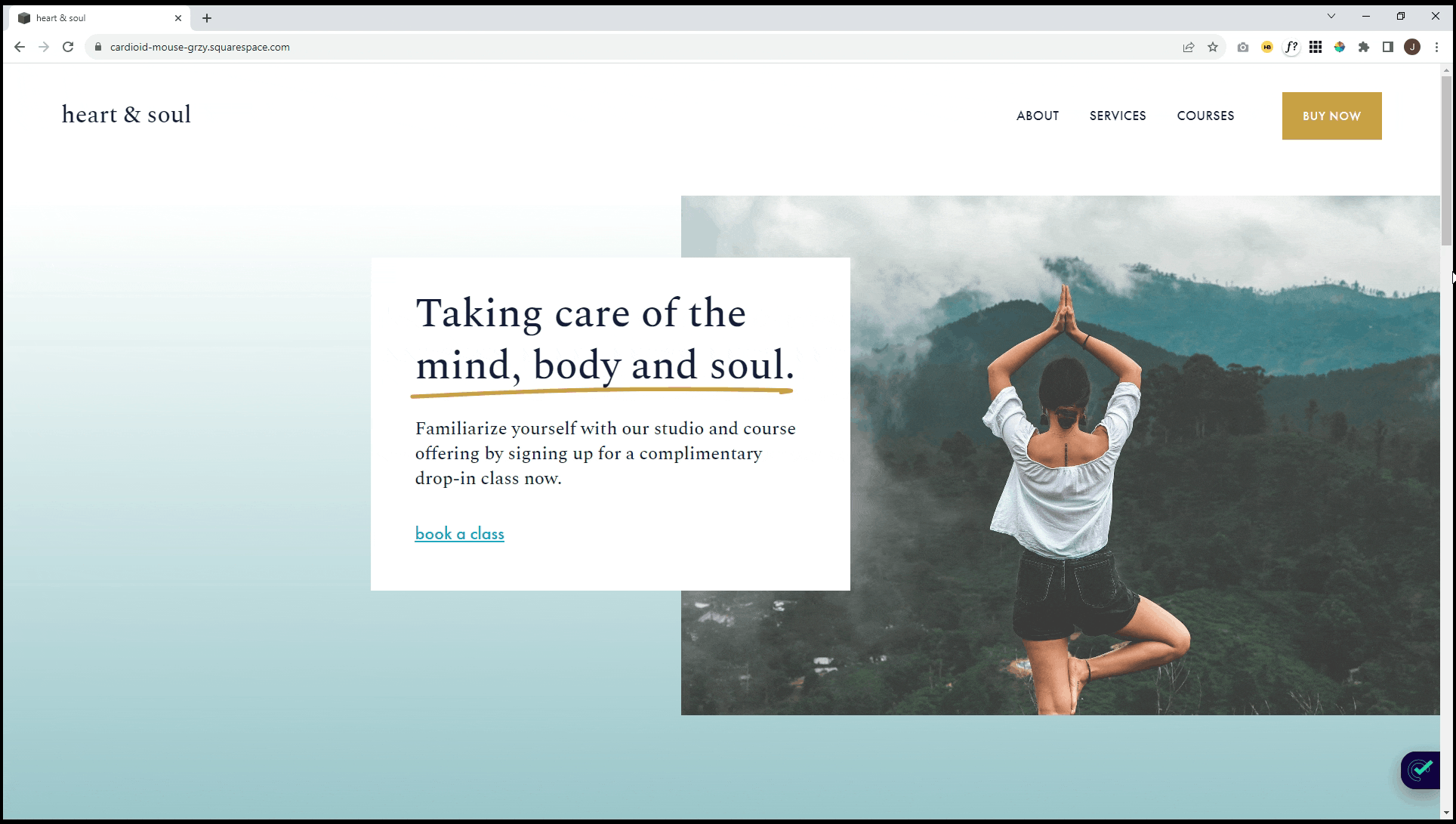
This first image is WITHOUT the new section. Notice how the gradient goes to the top of the page and there is a hard line where the white header meets the blue section below.
This image is WITH the small section that we added. It’s forcing the gradient to stop at the new section, which creates the smooth transition between the header and the block beneath it.


Another thing to keep in mind is whether or not to keep the header in a fixed position.
Click Edit Site Header to get to the header settings.
There are 3 options for the navigation:
Fixed position off
Fixed with scroll back
Fixed with basic
If you use the second or third option, then you're going to lose the gradient as you scroll because the white header will not move as the page scrolls (it’s fixed in place). Here are how all 3 types look in motion.
Not fixed: The header scrolls with the page.

Fixed - Basic: The header stays in place
Fixed - Scroll Back: The header reappears when you scroll back up.

The “Not Fixed” example looks the best, but if you want to maintain the header (for example, if your page is really long), then I recommend using “Scroll Back”.

DESIGN #2
This is another really classy look. Instead of fading into the header navigation, this is just a regular background gradient with a form block.
You could easily replace with a newsletter block, an image, or anything else. This gradient also goes from left to right, whereas in Design #1 the gradient transitions from bottom to top.

Here's how to achieve this look -
STEP 1: Add your content for the section (form block, newsletter, or whatever).
STEP 2: Copy this code and paste it in Website -> Website Tools -> Custom CSS
//background gradient colors//
section[data-section-id="64f0fe512b545d1e9fe8d184"]
.section-background {
  background-image: linear-gradient(90deg, hsla(187, 32%, 70%, 1) 0%, hsla(187, 54%, 88%, 1) 100%);
}
STEP 3: Replace the Section ID with your own ID.
Download the Squarespace ID Finder extension if you don't already have it (it's free!). Then go to your page, activate the extension, and copy the section ID by clicking on it.
Now that you have it, replace the entire top line of code (section[data-section-id="64ac195b0b1e87163be9591e"]) with your own section ID that you just copied.
The next section will show how to change the color in the code.

HOW TO CHOOSE YOUR GRADIENT COLORS
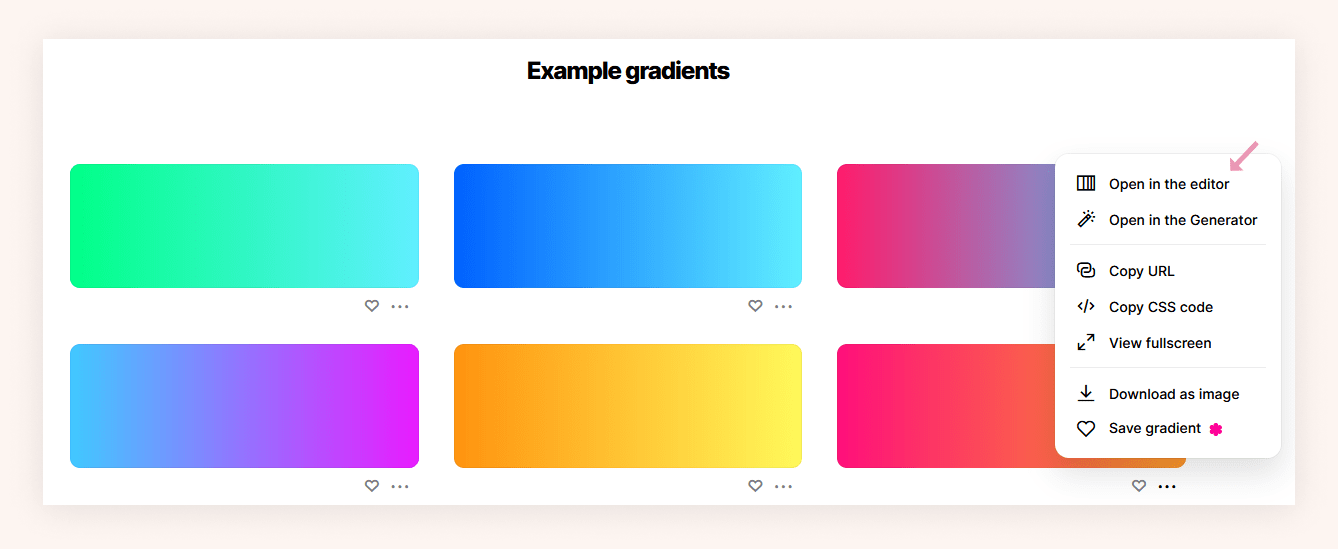
I like to use the Coolors gradient maker to create gradients. It not only is an easy way to choose your colors, but it also gives you the exact CSS you'll need.
There are TONS of example gradients to choose from. Click the 3 dots on any gradient to get more options. Choose Open in the editor if you want to tweak it any.
From here you can use the slider to move the transition, change the colors, change the rotation, or make the gradient linear or radial. You can also use the Random button for Coolors to randomly choose a gradient.
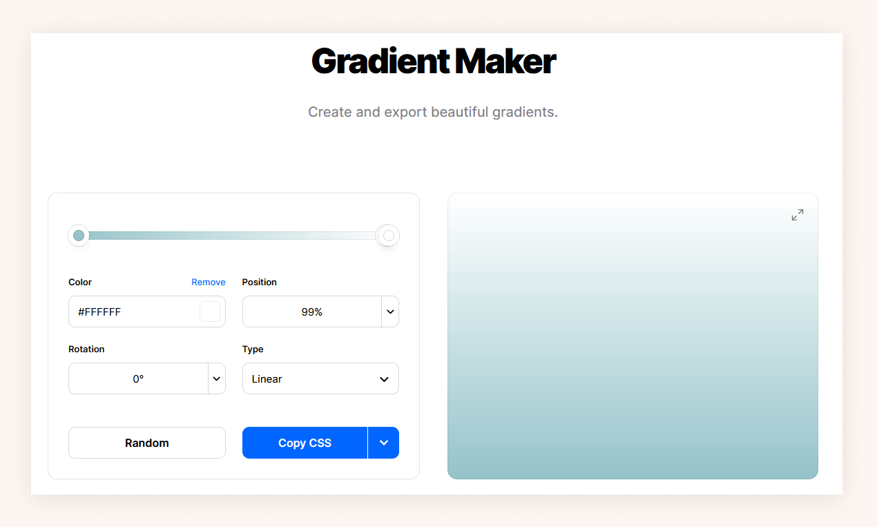
Once the gradient is the way you want it, click the Copy CSS button.
IMPORTANT: You do not need all of this code! Only copy the part that says "linear-gradient" through the “;” (it’s highlighted in the image below) and paste it over the linear-gradient code that I gave you earlier.
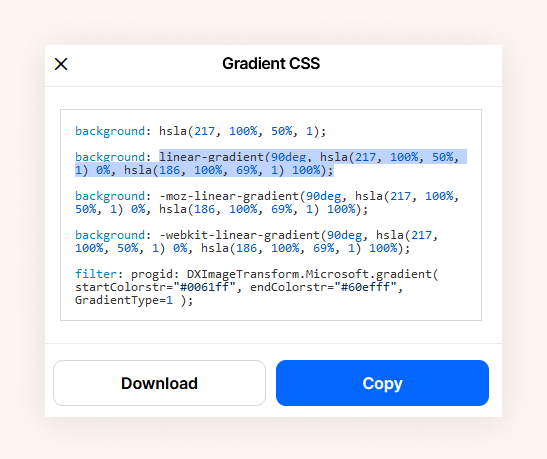
ALSO IMPORTANT: Be sure to keep the } character at the end of your code whenever you paste in the linear gradient, otherwise it won't work.
TIPS FOR CHOOSING COLORS
Choose wisely!
I recommend choosing colors that are similar in shade and hue. You wouldn't pair a bright green with a soft pink color. One is bold and one is soft, so they don't work well together.

Even colors that are in the same family but are not similar in vibrance will have too much of a spread in the gradient.

This probably goes without saying, but be sure you're choosing colors that are in your color palette!
If you get stuck along the way, please reach out! I’m happy to take a look at your code. And if you used this on your site, drop a link below in the comments!