
3 Ways to Design a Squarespace Accordion Block

Pin this post to Pinterest! ☝🏻
There was much rejoicing when Squarespace introduced accordion blocks a few years ago. Before accordion blocks, the only option was use the markdown block to accomplish the same thing, which required a lot of coding.
Accordion blocks make it so much easier, plus they have all of the design options for text, padding, dividers, icons, and much more. You can accomplish a great look without any coding since there are so many settings.
WHAT IS AN ACCORDION BLOCK?
Accordion blocks are collapsible items that expand when you click on them. They're great if you have a lot of text so that people don't have to spend time scrolling. Especially if you're on mobile - there's a lot more scrolling than on desktop!
WHEN SHOULD YOU USE AN ACCORDION BLOCK?
Accordion blocks are predominantly used for Frequently Asked Questions.
You can dramatically reduce the amount of text on your page by using an accordion block to display the question, then when you click the question it opens the answer. Trust me, no one wants to scroll through a bunch of question and answers trying to find the question that pertains to them.
Anchor links are another way to design Frequently Asked Questions, but personally I prefer the accordion block. For one thing, it just looks a little more clean, but also the collapsible blocks give it a high-end feel. Here’s how I use it for the FAQ’s on my Services page:

You might also use an accordion block on your services page if you have additional add-ons. For example, on my services page, I list everything that's included in a custom website.
I also offer additional services, but because I already have quite a few bullet points in the Custom Design section, I opted for an accordion block for the add-ons.
Not everyone is going to want an add-on, so it's better to just let people know it's there, and if they're interested they can open the accordion.

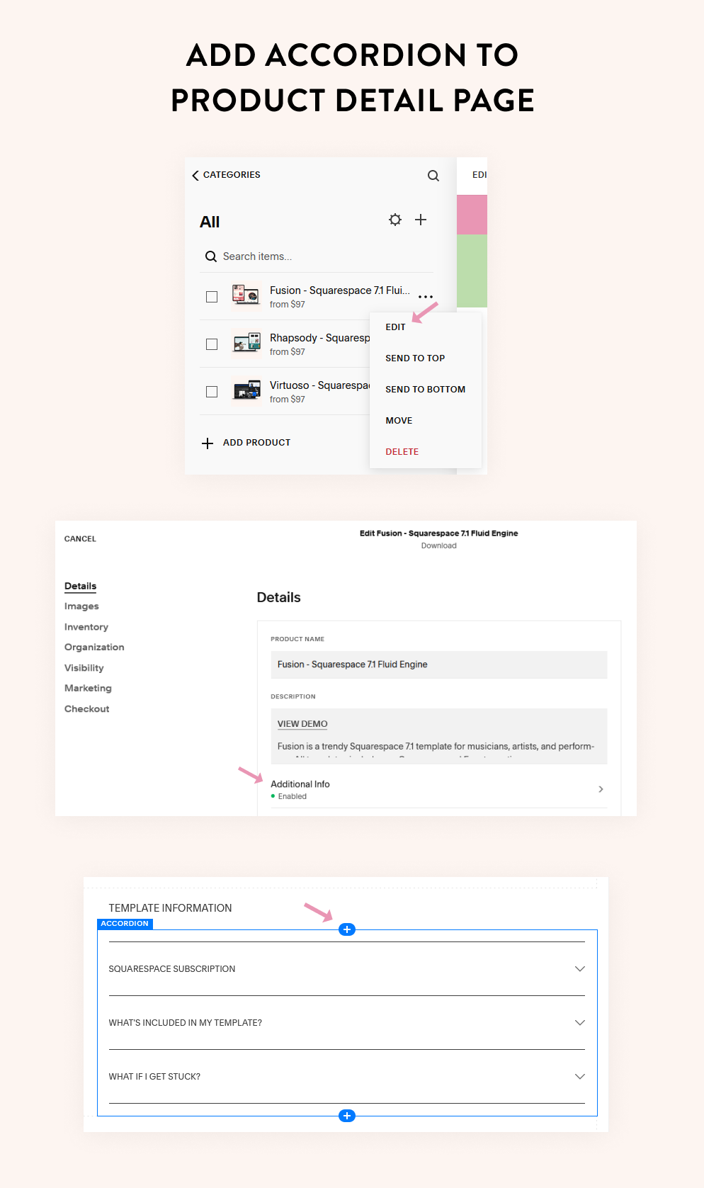
The third reason you might use an accordion block is for a product detail page. You could use an accordion block for shipping or return policies or just for more details on the item.
For my Squarespace templates, I use accordion blocks on the product detail pages to give a little more information about Squarespace, what's included in the template, and what happens if they get stuck.

Here's the thing, people have a million objections before they hit the 'buy' button. Your job is to provide information that helps them overcome those objections so that they'll complete the purchase.
Accordion blocks allow you to give them the information they need without overwhelming the page with too much text and taking away from the actual product.
Adding accordion blocks to product pages works a little differently than a regular page on your site. To add an accordion block to a product page, edit the product and click on Additional Info. Click the blue plus sign and choose Accordion Block.
HOW IT WORKS
To add an accordion block to a page in fluid engine, click Add Block and select the Accordion Block. If you’re using the basic editor, then click the blue plus sign (like the image above) and select Accordion Block.

Squarespace will load 3 dummy items. Just replace that content with your own. If you need more items, click Add Item.

Once you click on the item it will take you to the title and description. The Title is the heading that you see when the accordion is collapsed. Once it's expanded it will display the Description text. You can also duplicate it or delete it.
Click Back and then continue adding your content.

Now that we have the content entered, let's look at 3 different ways you can design your accordion. Between the options Squarespace gives you, plus any code that you add, you can create a lot of different looks for an accordion block.
DESIGN #1
This is a fairly basic design, but still looks good.
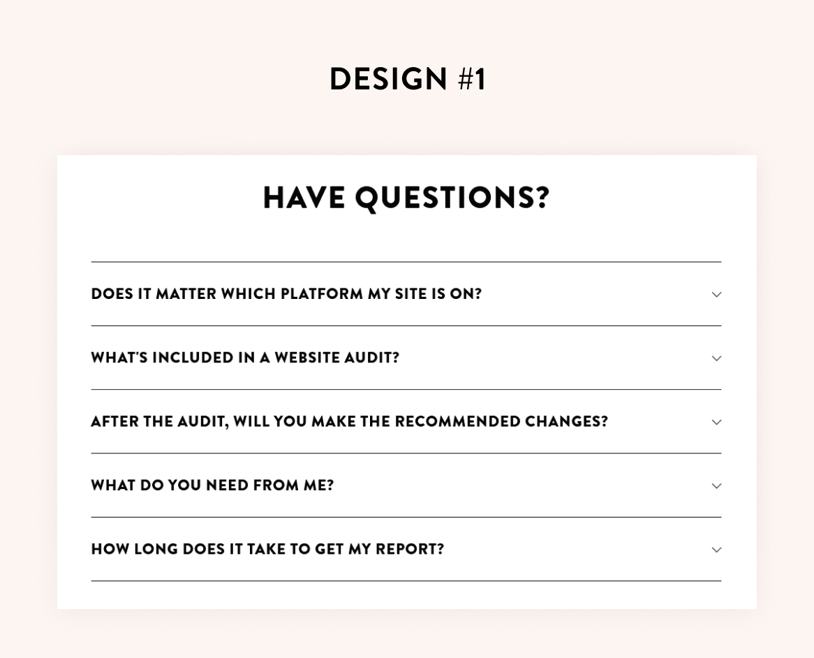
To get this look, click the Design tab.
You can copy the settings that I use, but I’ll explain them below in case you want to tweak anything.

Click the Title to choose which size font you want for the titles. I like h4 because it's a good size. You can switch it to the paragraph text if you prefer that over heading text. You'll notice that you can also change the alignment of the text.
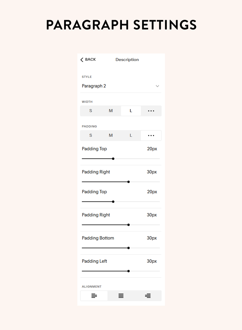
Click Back and do the same thing for the description text. The width adjusts the width of the description text WITHIN the block. It does not change the width of the block. I like to keep mine at 100%.
Things to know: If you click the 3 dots on the padding, it will give you more options so that you can set the padding for all 4 sides. If your padding is not working like you want it to, be sure that width is set to 100%.
Click Back to the main settings. From here you can choose to have the first item already expanded, allow multiple items to be open at the same time, and show the dividers. If you click Dividers, you will get more options.

Next, choose if you want the icon to be a plus sign or an arrow. Once you've selected your icon, choose the size, the thickness, and if you want it to be placed to the left or right of the title.
There is yet another option for row padding (just like in the description text). This padding is for the section itself (not just the description). And just like the description padding, you can click the 3 dots to get more padding options.
You can also choose if you want the accordion to have a background color, choose the color, and if you want the corners to have a rounded edge. And again, another padding option :)
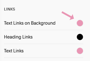
IMPORTANT: If you do toggle on the background switch, BE SURE that your font color for hyperlinks is a DIFFERENT color than the background. Sometimes Squarespace sets it to the same color, which means your text won’t be seen.
To double check, click the paint brush in the top right, click Colors, choose the color theme of your section, scroll down to the Links section and change the color for Text Links On Background.
DESIGN #2
I just recently started using this design. I think it looks nice with a bit more padding, some added color, and having space between each question instead of a divider line. You can see it on the website audit page.

Here are the exact settings:

Click the Description text to get to these settings:

DESIGN #3
This design is similar to the second one but with a bit more sophistication, thanks to a little bit of CSS. This design adds a line around the entire block (not just the horizontal lines), as well as giving the title a background. You'll also notice that the icon is the plus sign instead of the arrow and it's been moved to the left.

Here are the settings for this design:

Click on the Description text to get to these settings:
That will only take you so far, then you need to copy/paste this code into the CSS section. Go to Website -> Website Tools -> Custom CSS and paste it there.
section[data-section-id="64e51242d2a72631fa69a229"]{
/* accordion title background */
.sqs-block-accordion .accordion-item__title-wrapper {
    background-color: #F8CADB;
}

//remove dividers//
.accordion-divider {
  display: none;
}

//add border to bottom//
.accordion-item:last-child {
  border-bottom: solid 1px black;
}

//border around the side//
.accordion-item  {
  border: solid 1px black;
  border-bottom: 0;
}

//border in description//
.accordion-item__dropdown--open {
  border-top: solid 1px black;
}
}
IMPORTANT: There is just one thing to change in order to get it to work on your site. You'll need to swap out the section ID with the one on your site. To get your section ID, use the Squarespace ID finder extension in Chrome (download it for free).

Click the extension and then click the Section ID that the accordion block is in. Once you click it, it will automatically copy it.
Then paste it in the code to replace the section ID in the original code. Click Save, and you should now see the changes take place.
There are a few options if you'd like to tweak the code (don't be afraid to!). I've given descriptions above each code section that describes what that code does. You can increase the boldness of the border by adjusting the "solid 1px black" number - just make sure to do it in all parts of the code!
You can also change the hex code (#F8CADB) in the first part to change the color of the background.
Everything else can pretty much be left alone.

OTHER DESIGN SETTINGS
You may also want to change the color of the icon (both the arrow or the plus sign) or change the color of the divider. To do this, click the paint brush in the top right, click Colors, choose your theme color, then scroll down to the Accordion Block section. There you'll find the settings for both of these (including with/without a background color).

So which design is your favorite? If you have another design feel free to share it in the comments below.
Need some help implementing any of the designs? Schedule a free website tweaks session.
*This post may contain affiliate links, so I may earn a small commission when you make a purchase through links on this site at no additional cost to you.


