13 Beginner Web Design Mistakes to Avoid

Pin this post to Pinterest! ☝🏻
IN THIS POST:
So you've decided to build your own site using Squarespace? High five to learning something new!
Look, I am all about taking on a challenge and doing something myself. Heck, I've remodeled my entire house myself (yes, really...by myself). But if you aren't careful, there are some pitfalls that will make it SO OBVIOUS that you just created your first website.
Instead of looking like a rookie, avoid these 13 mistakes that most first time web designers make and you'll have a website that gets people asking, "Hey, who designed your website?!"
FAVICON
To me, this is the #1 dead giveaway that someone built their site themselves. What is a favicon, you ask? It's that little icon in the browser tab. The default favicon that Squarespace gives you is a little black box. Please, oh please... change it to your own!

I recommend making your favicon either part of your logo or the initials of your name (if your business name is your name). It's going to be TINY, so be sure it's something that looks good really small. If it has too many details, they won’t show up in an image that small.
I create my favicons in Figma, but Photoshop and Canva also work. Be sure to remove the background so that you don't have a square around your design. It needs to be 16x16px and saved as a .png. Also keep in mind that since the tabs are light, a white icon is not going to show up.
To upload your favicon, go to Settings -> Browser Icon -> and click the plus sign to add your image. Your image is going to look really blurry once it’s uploaded. That's because the image is 16x16px, but the preview is much larger than that, so it's distorting it. Don't worry, it will look normal in the browser tab.

STARTING ORDER NUMBERs AT 00001
Any time you sell something on your site, Squarespace assigns it an order number. By default, it will start with 00001. The order number is also in the confirmation email that the customer gets. You definitely don't want them getting a confirmation that says they were the 4th customer!
Thankfully, Squarespace lets you change the number that it starts counting from.
Go to Commerce -> Commerce Settings -> Cart & Checkout -> Checkout. Here you'll find "Next order number" and you can type in any number. Any random number will do. Now when someone sees that they were order #231985 they're going to think you've had a ton of sales!

INCLUDING 'HOME' IN THE NAVIGATION
Your logo in your top navigation will automatically link to your home page. You don't have to set anything for it to do that. Because of that, it's not really necessary to include a link in the top navigation that says "Home". People instinctively know to click the logo to get back to the home page.
Same thing goes for your footer. Add your logo (you will need to link it to your home page) and then remove "Home" from the navigation.
To remove it, just drag the Home page down to the "Not Linked" section.

INCORRECT PAGE NAMES
This mistake not only looks bad, but it's bad for SEO! I can't tell you how many pages I see that are named /new-page or /blog-4. This can happen a lot if you're duplicating a page.
When you duplicate a page, it will ask you to give the page a name. But! The settings on the page don't update with the name you give it. For example, if you name the page Audit, it doesn't adjust the URL to say /audit. You will need to go back and change the URL to reflect the page name.
TIP: If your URL has multiple words, be sure to separate them with a hyphen. Like, /this-is-a-page instead of /thisisapage.
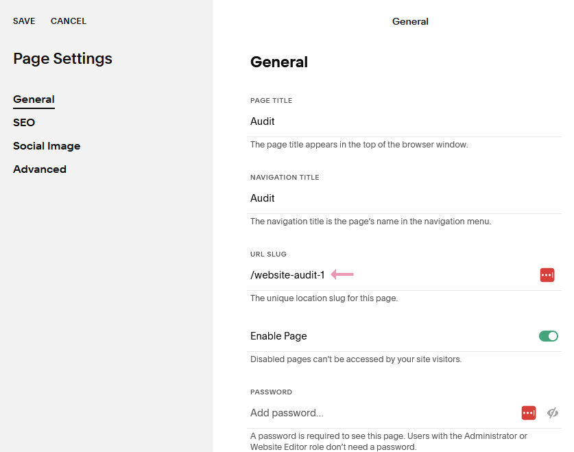
You'll also need to change the SEO settings if you duplicate a page.

INCORRECT IMAGE NAMES
This is another mistake that will impact your SEO ranking. When Google crawls your site, it reads the names of your images. BE SURE not to have an image called photo1.jpg or 8SNWQ815.jpg. Google has NO idea what that is!
Your image names should tell what the image is, but don't be SO descriptive that it takes 10 words to explain it (you can use more words in the alt tags). Also, be sure to separate each word with a hyphen (not a space and not words running together) so that Google can read it.

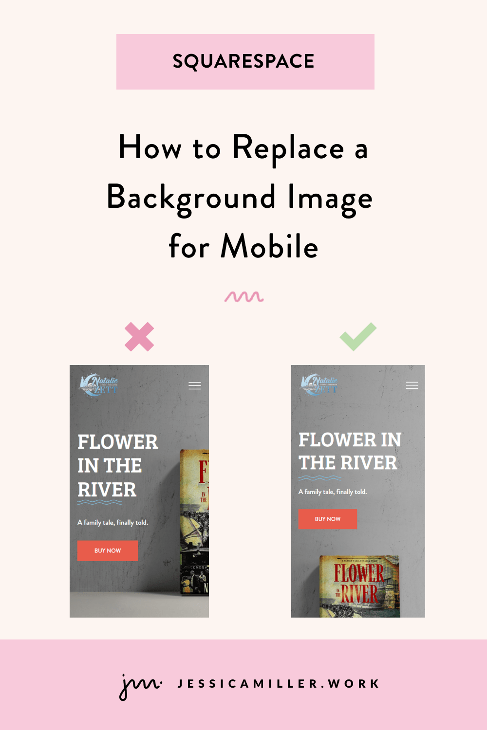
NOT CHECKING MOBILE VIEW
If you're using the Classic Editor, then this isn't such a big deal since it automatically makes your site responsive for mobile. But most people are using Fluid Engine these days, which requires you to make the changes yourself to ensure the design is responsive.
To edit the mobile version, click the mobile icon in the top right corner.
It's going to look like a mess the first time you see it. That's why it's important to adjust the position, sizes, and order of everything. You can use the arrow keys to move a section up or down, or just click it and drag it.
Theoretically, whatever changes you make to the mobile version will not effect the desktop version. But I ALWAYS go back and double check the desktop version to make sure it looks the same (sometimes it messes with the spacing).

INCORRECT SPACING
Never underestimate the importance of padding! Padding is the space around elements, whether it's text or shapes or whatever. Your site should have plenty of room to breathe. There's no reason to cram everything together. In fact, it makes it harder on our eyes to read when there isn't enough space - and we sure don't want anyone clicking off of our site.
A lot of times people don't put enough space above and below the text in each section. Or they have inconsistent spacing - too much at the top and not enough at the bottom.
To adjust the spacing, click Edit Section, and adjust the Section Height. You can also use the alignment buttons to align your content to the top or bottom of the section.

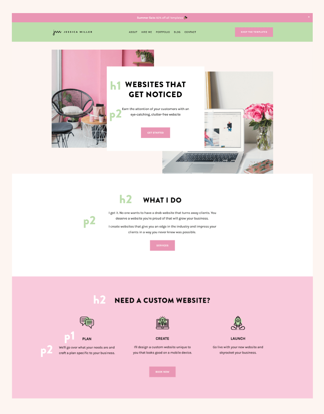
INCORRECT HEADING/PARAGRAPH TAGS
There should be a hierarchy to your page when it comes to headings and paragraphs. This not only helps your readers, but it's good for SEO too (are you picking up that LOTS of things matter when it comes to SEO? 😉)
You want to use an h1 (Heading 1) tag for the header text on each page. There should only be one h1 per page. The rest of the headers on the page will most likely be h2. Sometimes I also use h4 if I'm doing a small sub heading before the main heading.
I typically use p2 (Paragraph 2) for my paragraph text, but sometimes I will use p1 if I need something to be a little bigger.
You can adjust the font sizes by clicking the paint brush in the top right corner, then Fonts, then click Heading or Paragraph to adjust the size of the font.
This is how the tags are laid out on my site:
MISMATCHED/WRONG NUMBER OF FONTS
Fonts and colors are so, so important to your site. Do not overlook this! Most people either have too few fonts or too many fonts. You want to use 2-3 fonts on your site that compliment each other. They don't necessarily have to look similar, but they need to look good together.
This is a great article on font pairings that has 30 font combinations. I also usually search Pinterest for font pairings. Squarespace has TONS of fonts, so chances are if you find a font you like, it's already going to be loaded into Squarespace. However, you can also add custom fonts to your site.
This image is a good illustration of how serif and sans serif fonts can work together. The fonts below are Source Sans Pro, Fira Sans, and PT Serif (in that order).

NO DESIGNATED COLOR PALETTE
Color palettes are equally as important as your font pairings! Typically people either use way too many colors, colors that don't match, or not enough colors. I would choose your colors based on colors in your logo or colors in your images.
Squarespace has several color palette recommendations if you go to the Site Styles (paintbrush icon) and choose Colors and click Edit Palette. However, I usually just choose my own. Coolors (below) and Adobe Color are both good resources for finding colors that work well together.

I also see a lot of websites that have wayyyy to much text against a solid color background. Sorry to say it, but no one is reading that. If you want your text to be read, then break it up into smaller chunks so it's easier for people's eyes to digest.
This is where color comes in... when you have a defined color palette, you can create different colored sections so that your page isn't one big white background. Then break the text up into smaller segments to place in each section.
“MADE WITH SQUARESPACE”
If you use one of Squarespace's premade templates, it's going to say "Made with Squarespace" in your footer. There is nothing that says you have to keep this!! So delete it 😉
Most people put who designed their website in the footer. If you didn't have a web designer, then just put nothing - or put your own name. But to put Squarespace's name just reeks of "I don't know what I'm doing so I thought I'd take a stab at this template."

USING EVERY DESIGN OPTION AVAILABLE
There is a saying I often use when it comes to design - "Just because you CAN doesn't mean you SHOULD". There are a lot of design options in Squarespace - wavy divider lines, animation, underline squiggles, etc. It's easy to go overboard with these and quickly turn your site into something gaudy.
Instead, think of these design elements as salt... just sprinkle a little onto your site without doing too much, otherwise you're going to turn people off.
This is too much:

NO CALL TO ACTION BUTTONS
As the scene in Pretty Woman goes, "Big mistake...Big! HUGE!"
Your website exists because you have something to offer people. What do you offer? What do you want them to do? Schedule an appointment? Buy your product? Whatever it is, you need call to action buttons (CTA) everywhere on your site. And not just any button, but buttons with an accent color that stand out above anything else on your website.
Take a look at my home page... nearly every section has a call to action button. Either to purchase a template, read the blog, hire me, etc. It's clear what I want the customer to do.
I always recommend having a CTA button in the header navigation. When someone lands on your website for the first time, it's all new to them. Where do I go? What do I read? Your CTA button tells them, "Right this way..."
Not having a CTA button is like walking into a restaurant without a hostess. Where do you sit? Do you pick a table or wait for someone? You don't want someone ambling along, lost on your site trying to figure out where to go. So, help them out with a button.
TOO MANY LINKS IN NAVIGATION
Which leads me to my next point... too many links. The links in your top navigation are like doors that your customer can go through. The more doors you have, the more choices they have. And more choices cause decision fatigue. You don't want them asking, "Which one first?" or "Which one is the best?" So pare your 'doors' down to just a handful.
I once had a customer who had 47 links in their top navigation. 47!! How could ANYONE decide where to click first??
Another reason to not have too many links is because the words will start wrapping into two lines depending on what size someone's screen is. And that just doesn't look good. I have 5 links, plus a CTA button in mine, and I feel like that is the max for me.

*This post may contain affiliate links, so I may earn a small commission when you make a purchase through links on this site at no additional cost to you.