6 Common Home Page Mistakes (and What to Do Instead)
Pin this post to Pinterest! ☝🏻
Your home page has one job: SHOW visitors where they need to go.
Sounds simple, right? But after working on a lot of Squarespace web design projects (and peeking at more DIY sites than I can count), I’ve noticed a pattern. Most people either don’t give their home page enough love… or they accidentally sabotage it without realizing.
Today I’ll show you how to fix that.
Here are some of the most common home page mistakes I see — and how to make sure your site is helping you, not hurting you.
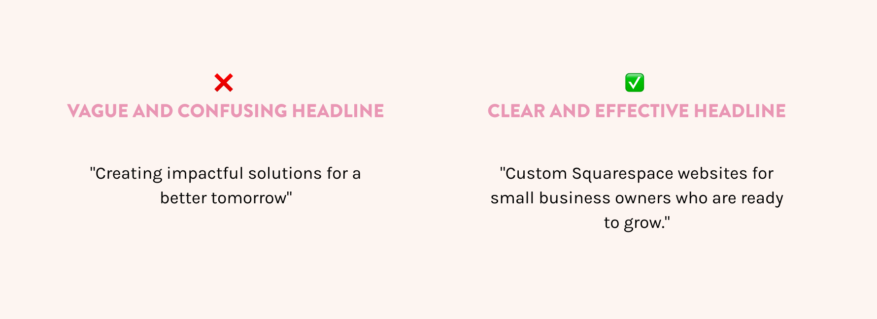
Mistake #1: Being too vague
There’s a difference between being clever and being clear. If your home page headline says something like “Welcome to my corner of the internet” or “Helping people thrive,” chances are your visitors are confused.
You have exactly .05 seconds to ‘wow’ them and convince them to stay on your page. Believe me, that’s a tall order.
DO THIS Instead:
Use the top section of your home page to tell visitors exactly what you do, who it’s for, and why it matters. You don’t have to say everything — just enough to get them to keep scrolling.
How do you do that? Use simple words. Make it clear.
This is your one shot at a first impression. Make it count.
Mistake #2: No clear call to action
Here’s a stat that might hurt a little: Most DIY websites have maybe one call to action on the entire home page.
That’s not enough.
DO THIS Instead:
Add a clear call to action in every major section of your home page. A good rule of thumb is 3–5 CTA buttons that point people where you want them to go — whether that’s booking a service, viewing your portfolio, or signing up for your email list.
If you’re not sure what to say on your buttons, I’ve got a post about better CTA examples that will help.
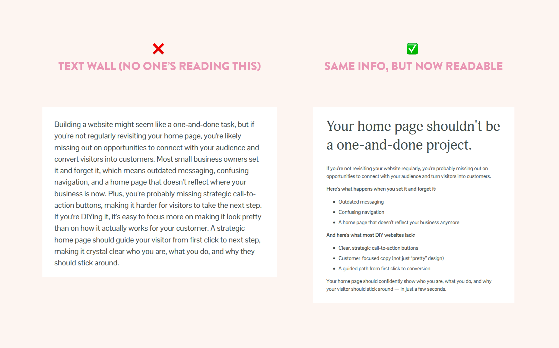
Mistake #3: Overexplaining (and overwhelming)
If your home page looks more like a novel than a website, visitors are going to bounce. Fast. Even if what you’re saying is helpful, people don’t read web pages the same way they read books.
They skim. So give them something skimmable.
DO THIS Instead:
Break up your text. Use headlines, subheadlines, short paragraphs, and strategic visuals. You can always link to your About page or Services page if someone wants more.
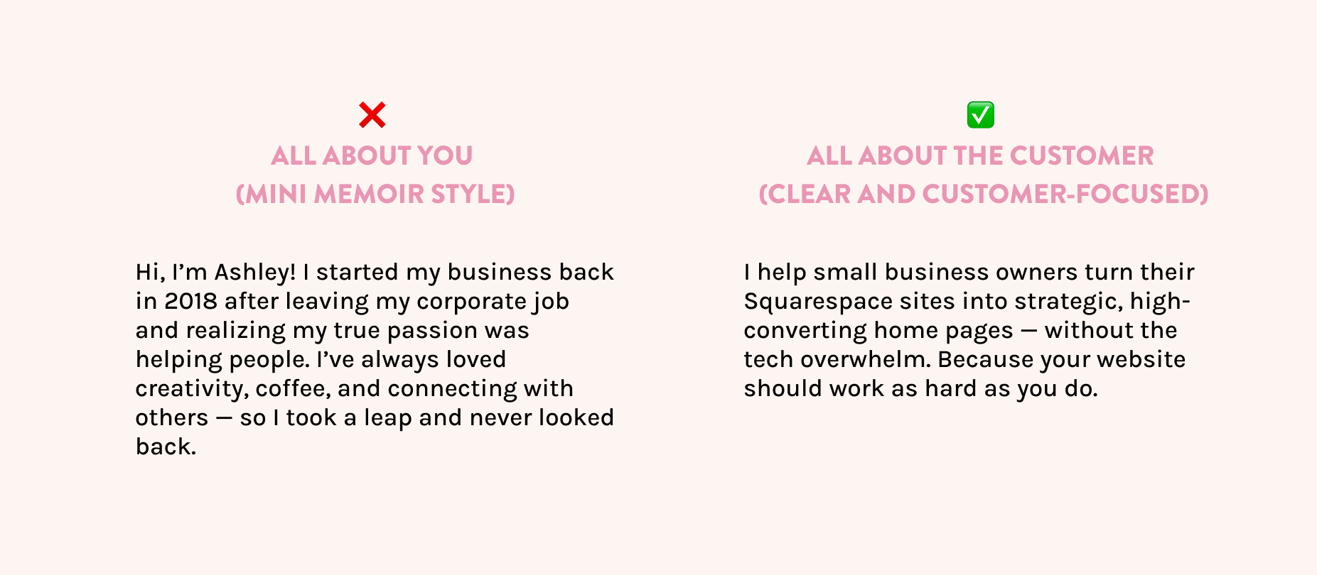
Mistake #4: Making it all about you
Yes, it’s your website. But that doesn’t mean it should be about you.
Too many Squarespace sites lead with a mini memoir: “Hi, I’m Ashley, I started my business in 2018 because I love lattes and helping people…” and by the time your visitor finishes reading, they still have no idea what you do or how it helps them.
DO THIS Instead:
Make your visitor the hero of the story. Lead with their problem, then position yourself as the guide who helps solve it. Your “About” section still has a place — just not at the very top of the home page (and not focusing on you).
Mistake #5: No structure or hierarchy
If everything on your home page has the same visual weight — same font size, same tone, same layout — nothing stands out. And when everything is “important,” nothing is.
Your home page is not the place to feature everything. Instead, it should be a “welcome desk” - it’s a place to point people so that THEN they can read everything about that item or subject.
DO THIS Instead:
Use headings, section breaks, and layout contrast to create flow. The best home pages feel like a guided experience: the eye knows exactly where to go next.
This is where good web design really shines. And if you’re using Squarespace, the right spacing and section styles can do a lot of the heavy lifting.
Mistake #6: Forgetting trust builders
If you’re asking someone to hire you, buy from you, or join your list… you need to give them a reason to trust you.
That’s what most home pages are missing — they look like the business owner just opened a new bank account last week, threw together a website, and suddenly they're "in business."
Instead of looking like you just appeared on the scene last week, position yourself as a professional who knows exactly how to solve your customer's problems — with credibility that speaks for itself.
People want to know they can trust you before they make a purchase, and your home page is the perfect place to show them why you're the right choice.
DO THIS Instead:
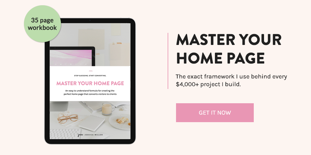
Add some social proof: testimonials, client logos, a personal message, a photo of your face (not a stock photo of a stranger holding a coffee cup). These details help people build trust with you and feel confident saying yes. Don’t have these things yet? That’s ok. The Master Your Home Page guide will walk you through exactly what to do to create a trustworthy and compelling home page.
Your home page doesn’t have to be perfect — just intentional
If you're making any of these mistakes, you're not alone. The good news? They're all fixable.
And if you want a step-by-step roadmap to help you actually turn your home page into a confident, conversion-friendly experience… my Master Your Home Page workbook will walk you through it.
It’s packed with strategy, examples, and action steps — no fluff, no jargon. Just the clarity your home page has been missing.
*This post may contain affiliate links, so I may earn a small commission when you make a purchase through links on this site at no additional cost to you.