How to Increase Online Donations: Why Your Nonprofit Website Might Be the Problem
Pin this post to Pinterest! ☝🏻
In all of my experience redesigning websites for nonprofits, I've noticed a pattern.
The organizations that are doing the most meaningful work often have the weakest online presence, and it's costing them donors they don't even realize they're losing.
Donors are such a vital part of sustaining the mission that it's imperative to have a website that captures donors and persuades them to donate. Let's start with addressing what’s wrong so you can create a website that increases donations.
MISTAKE #1: YOUR WEBSITE TALKS ABOUT YOU WHEN IT SHOULD BE TALKING ABOUT THEM
This may sound like an odd concept, but your donor is the hero of the story, not your organization. The moment your website positions itself as the hero ("we were founded in 1987, we have 12 programs, we serve 4 counties") you've lost the donor.
People don't give to organizations. They give to outcomes. They give because they want to be part of something that changes lives.
SOLUTION:
Your website needs to answer one question in the first 3 seconds - "What will my donation do"?
Not what your organization does, but what the DONOR'S money does. Give them an opportunity to be the hero in the story.

MISTAKE #2: THERE IS NO CLEAR VILLAIN
You may be scratching your head wondering why we're talking about villains on a nonprofit's website, but there is a point here. Every organization has a villain that the nonprofit exists to solve - whether that's hunger, illiteracy, homelessness, etc.
After all, that's why your organization exists!
The problem is, most nonprofit websites bury the villain because they don't want to seem negative. But donors give when they feel the urgency of the problem. You NEED to talk about the problem.
SOLUTION:
Instead of avoiding the negative, lean into it. Paint the picture of what life looks like if they DON'T give - starving children, unclean water, sleeping outside in the cold, etc.
The donor needs to actually FEEL why it matters that they act today.
MISTAKE #3: THE CALL TO ACTION IS WEAK OR BURIED
"Learn More" is not a call to action. Likewise, the "Donate" button buried in the navigation menu is not a call to action either. If people have to work too hard to find where to give, the hard truth is that they just won't.
They'll give up.
SOLUTION:
Every page of your website should have clear, prominent, direct calls to action. "Give Today." "Feed a Child." "Fund a Mission." Make it impossible to miss and make it specific enough that the donor knows exactly what they're doing when they click it.
Don't make them jump through too many hoops (i.e. click through too many steps) to donate. Ideally, you want the Donate button to be in your top navigation and stand out.

MISTAKE #4: THEY LEAD WITH PROGRAMS INSTEAD OF PEOPLE
This is huge.
Donors don't connect with programs. They connect with people.
If you're not sharing the stories of lives that have been changed from your organization, then you're missing an opportunity. Donors want to see the transformation. They want to know that when they give to the mission that their donation is impacting other lives just like the ones you have on your website.
SOLUTION:
One specific story of one specific person whose life changed because of your organization is worth more than a list of every program you run. Put a human face and a human story front and center. Let the donor see themselves as the reason that story happened.
MISTAKE #5: NO SOCIAL PROOF
If a donor has never heard of your organization, they need evidence that you're legitimate and effective before they'll give. People aren't likely to give to an organization that can't demonstrate the proof of their mission.
There's too much fear and uncertainty involved.
SOLUTION:
Numbers of impact — meals served, people housed, countries reached — build credibility fast. Testimonials from people you've helped or from longtime donors do the same.
Without social proof, you're asking a stranger to blindly trust you with their money.
NOT SURE IF YOUR WEBSITE HAS THESE PROBLEMS?
I offer a free Website Assessment for nonprofits where I look at your site specifically and tell you exactly what's working and what's costing you donors. Nonprofits are one of my favorite types of clients because I love that I get to help further your mission.
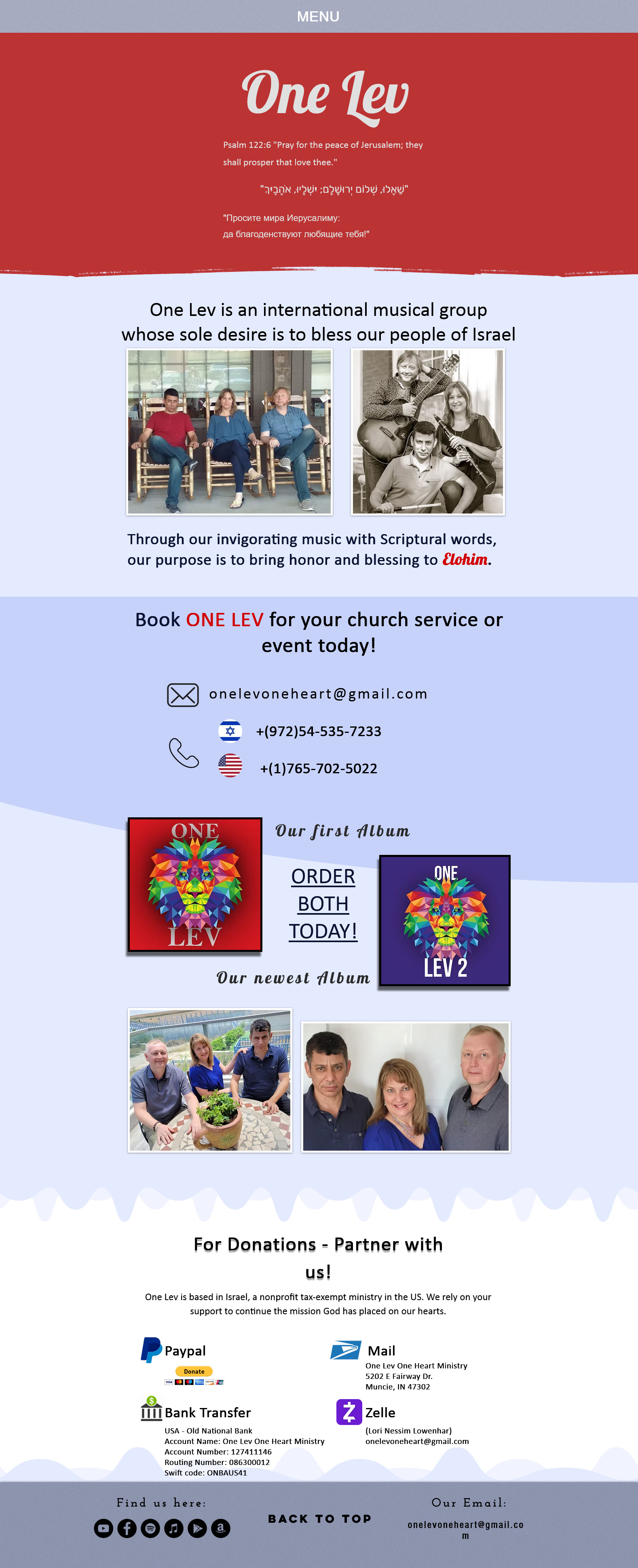
Here's aN example of a donation page THAT ACTUALLY works.
One Lev's old website didn't even have a designated donation page; it just had a section at the bottom of the home page. It wasn't even possible to donate online.
Their newly designed website not only has a designated page for donations, but it checks all of the boxes:
Donate button in the top navigation that stands out
Testimonial by someone impacted by the ministry
Explanation of what happens when you give
Invitation to partner together
Donation form with preselected amounts and the ability to donate on a recurring basis