Sophisticated Website Redesign for a Professional Actor, Singer, and Voice Artist
TIFFANY RENEE BEAR
Tiffany Renee Bear is a professional actor, singer, and voice artist with credits including Hallmark, Honda, O'Reilly Auto Parts, and Omaha Steaks. She's also a longtime Sight & Sound Theatre performer, with a significant body of stage work that holds a prominent place on her new site.
She's built a career that most actors dream about, and her website needed to match that level.
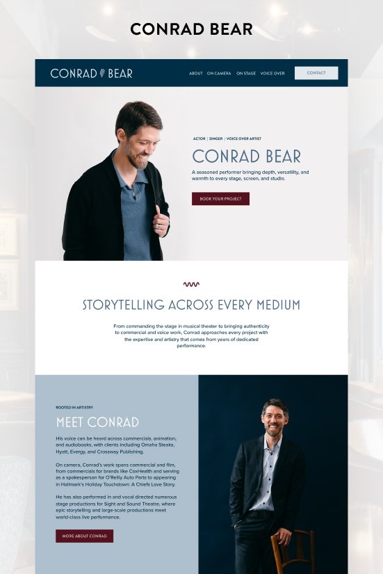
You may also recognize her name since I also redesigned the website for her husband, Conrad Bear.
The Problem
Tiffany’s old site had personality, but the wrong kind for where she is now. It felt young and casual in a way that wasn't serving her anymore. Her website wasn't keeping up with her career, and it wasn't giving her portfolio the presentation it deserved. That needed to change.
She wanted something sophisticated and mature but still warm and approachable. Her own reference point was Audrey Hepburn with a girl-next-door quality.
THE SOLUTION
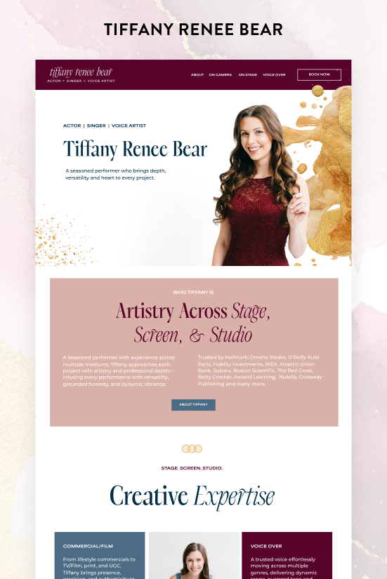
Tiffany came to this project with a full professional shoot already completed, which is one of the best things a client can do before we start working together. Professional photos become the foundation everything else is built on, and they make it possible to build something that actually looks high-end.
Her shoot had two distinct looks. The first was a deep burgundy dress; very elegant and polished. The second was a denim jumpsuit; relaxed, playful and just as charming. Together they captured exactly who she is, and they also set the color palette for the site.
I used the burgundy as the base, brought in a soft denim blue alongside it, and added a rose-pink accent to keep it from feeling too heavy. Tiffany wanted gold woven throughout as well. It ties everything together and adds a warmth that fits the overall aesthetic.
The heading font is Dark Paradise, and it does a lot of heavy lifting. It has beautiful curves and ligatures and looks polished and feminine without being overdone. It comes in a bold upright style and a softer italic, and the two complement each other really well when used together in headings. Montserrat handles the body copy. It's clean and simple and completely stays out of the way, which is exactly what you want from a paragraph font.
A couple of features are worth highlighting specifically. On the Commercial and Film page, instead of a standard headshot gallery, I created a GIF cycling through her range of looks. It's eye-catching, it's compact, and it shows off her versatility in a way a static grid just doesn't.
She also had a collection of stills from her commercial work, which I showcased in an auto image slider that keeps the page feeling active. These aren't features you'd get from an out-of-the-box template, and they make a difference.
The Result
Tiffany now has a website that actually reflects who she is and where she is in her career. It's professional, it's organized, and it looks the part.
Her portfolio is organized and easy to explore, and the site looks like it belongs to someone at her level.
Scroll through the home page

Pin this post to Pinterest! 👇🏻