Clean and Minimalistic Squarespace Website for a Music Arranger

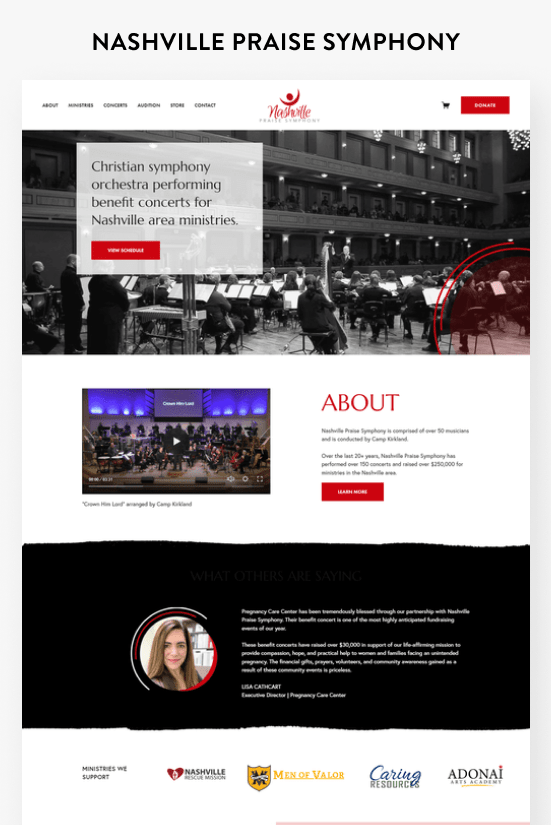
CAMP KIRKLAND
Camp's previous website faced significant challenges, particularly in the outdated and cumbersome process of selling music arrangements. Limited to PayPal transactions and manual email delivery of music files, the system proved slow and exclusionary for potential customers without PayPal accounts. Additionally, the lackluster visual appeal of the site hindered Camp's ability to attract commission pieces and workshop opportunities.

In the redesign, a strategic approach was taken to enhance both the aesthetic and functionality of the website. Retaining the existing logo and burgundy color, two complementary shades of blue were introduced, forming a cohesive and visually appealing palette. To add an artistic touch, a paintbrush effect was incorporated throughout the site, injecting vibrancy and a unique visual element.
The purchasing process underwent a significant overhaul. Customers can now choose to check out using PayPal or credit cards, and all arrangements are set up as automatic downloads. This streamlined process ensures that customers receive their purchased items instantly, eliminating delays and hassles.

The results speak for themselves, with a remarkable 76% increase in sales in the first year following the website launch. The user-friendly checkout process and the eye-catching design have successfully captured visitors' attention, encouraging them to explore the site, leading to a substantial boost in sales for Camp's music arrangements.
Scroll through the home page

Pin this post to Pinterest! 👇🏻