
Fresh and Vibrant Squarespace Website for a Non-Profit Organization

GLOBAL MISSIONS PROJECT
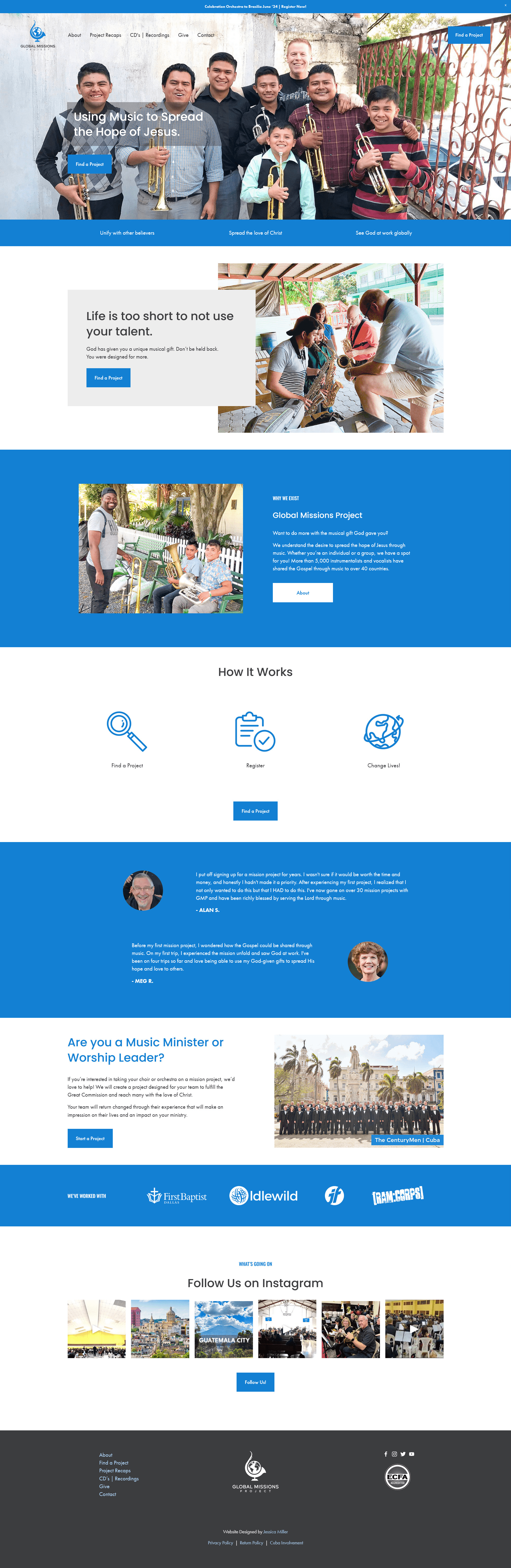
Global Missions Project underwent a complete rebranding, addressing not only their outdated website but also their logo, fonts, and color palette. The new logo stands out as captivating and memorable, featuring a brighter shade of blue that enhances its visibility and recognition.
The website, once cluttered with unnecessary pages and links, underwent a transformation towards simplicity, focusing on user-focused content and streamlined navigation.

To convey the organization's credibility and expertise, statistics highlighting the number of participants and projects over the last two decades were strategically incorporated. This data reassures visitors that Global Missions Project is a reliable organization.
The text was carefully crafted to address the customer's problem, emphasizing how the organization actively contributes to solving it. Strong testimonials were included to underscore the real-world impact of their mission projects.

The result is a user-friendly website that not only looks contemporary but also effectively communicates the organization's mission, values, and impact. The simplified structure has significantly improved navigation, which has increased the number of participants on mission projects.
Scroll through the home page
Hey, I'm Jessica, a Squarespace designer with over a decade of experience. If you're the kind of person who reads a blog post to figure things out yourself, my hat goes off to you. But there's a difference between fixing one thing and knowing for sure that your whole homepage is working.
Master Your Home Page ($37, a fraction of my $97 audit) breaks down exactly what to include. [Get the guide]
Already know you want it done right the first time? Email me or book a free 30 minute call.
Pin this post to Pinterest! 👇🏻


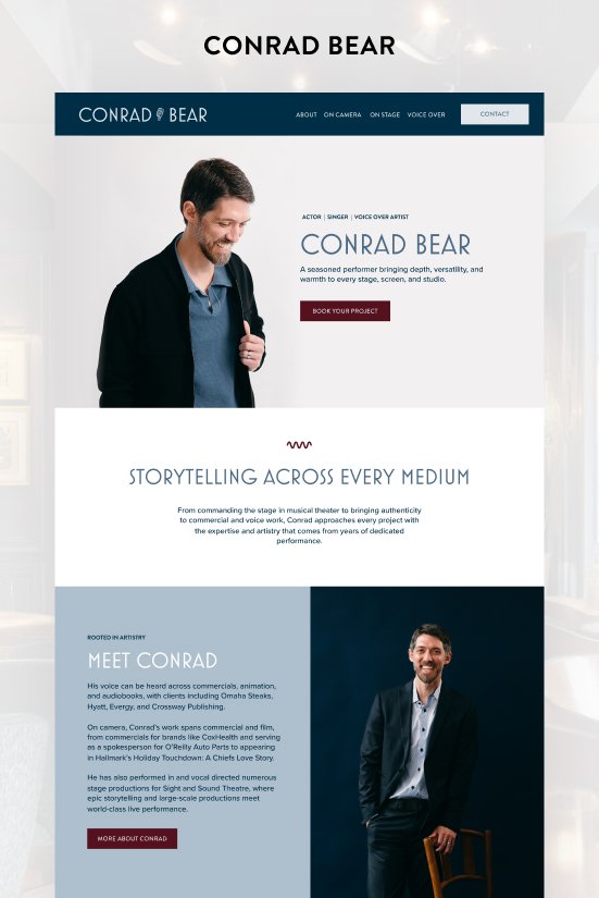




Nicholas Ratush's website underwent a remarkable transformation. He went from having a DIY-ed website with a bland color palette to a new website with a high-end logo and an eye-catching color palette that breathes life into the design. Now, Nicholas has a website he can proudly showcase that acts as a powerful magnet to draw in potential clients.

Nourish ETX needed a website and logo that mirrored the distinctive charm of their business. The website was designed with meticulous attention to detail. Original graphics featuring elegantly designed wine bottles were seamlessly integrated, ensuring an immediate visual allure.


Dr. Don’s website was not working for him at all - the color choice didn't match his brand, it lacked call to action buttons, only part of his inventory was listed, and the text didn’t identify the customer’s problems. I gave him a complete branding makeover - a new website, new logo, and new business cards.
 Jessica Miller
With 13+ years of experience, I design custom Squarespace sites that are strategic, intuitive, and built to convert. I specialize in advanced customizations, eCommerce setup, user experience, and strategic site flow.
I love collaborating with clients to bring their ideas to life - without the overwhelm.