Vintage Hollywood Website for a Multi-Talented Actor, Singer, and Voice-Over Artist
CONRAD BEAR
Conrad Bear is a professional actor, singer, and voice-over artist with a résumé that speaks for itself. He's worked with household names like Hallmark, Honda, Hyatt, Edward Jones, and O'Reilly Auto Parts, performs with Sight & Sound Theatre in Branson, Missouri, and stays busy with film, TV commercials, musical directing, and voice-over work. In short, Conrad does it all — and does it at a level most performers spend a lifetime chasing.
His website just wasn't keeping up.
The Problem
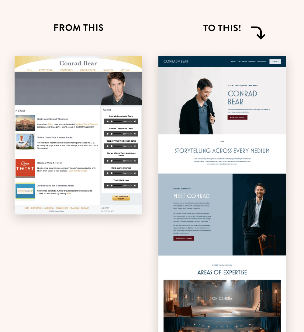
Conrad's old site had a lot going against it. The layout was two columns of dense, compact text — the kind that makes visitors work too hard just to figure out what they're reading. Each page was short and flat with no visual flow, no calls to action, and no real sense of who Conrad is as a performer. His entire body of work wasn’t represented on his website either.
It looked like the website of someone just starting out — not a seasoned professional with a long list of major brand credits to his name. Conrad had even stopped telling people he had a website altogether. That said everything.
THE SOLUTION
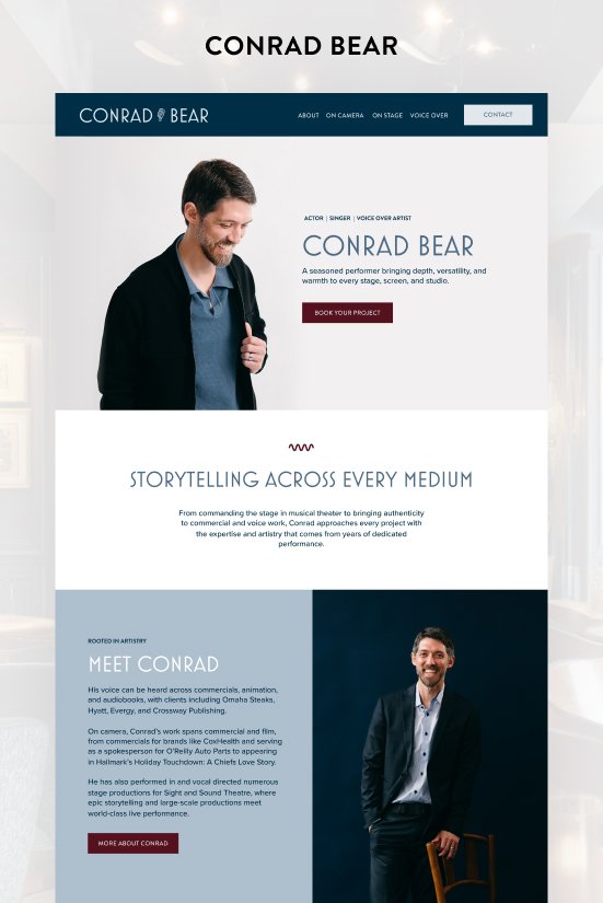
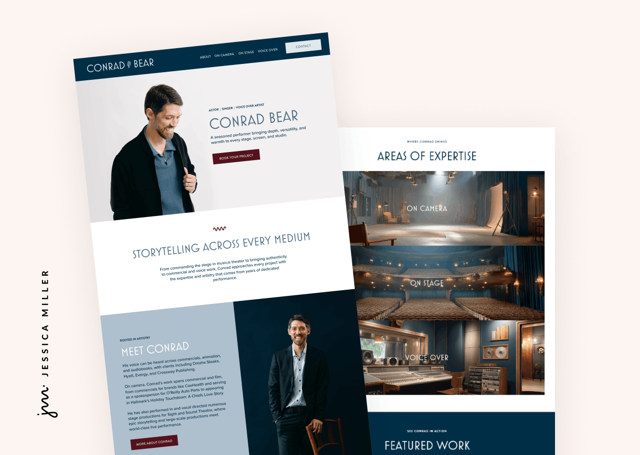
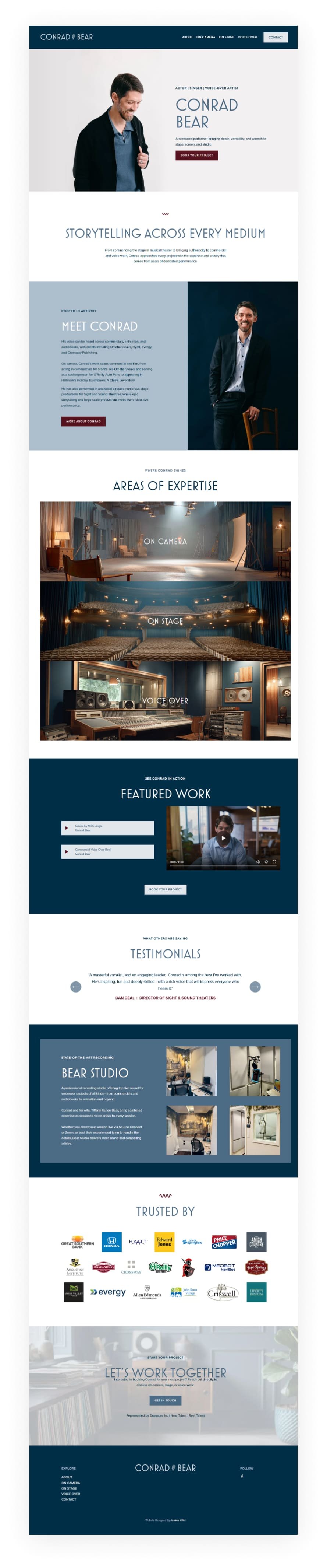
Conrad came in with a clear vision: a vintage Hollywood aesthetic — think mid-century supper club, old-school glamour, Bobby Darin energy. And the smartest thing we did early on was nail down the brand concept before his photo shoot. That meant Conrad could walk in already knowing his colors, his wardrobe, and his props. He incorporated a vintage-style standing microphone into several shots, and the whole session was built around the look we were creating together.
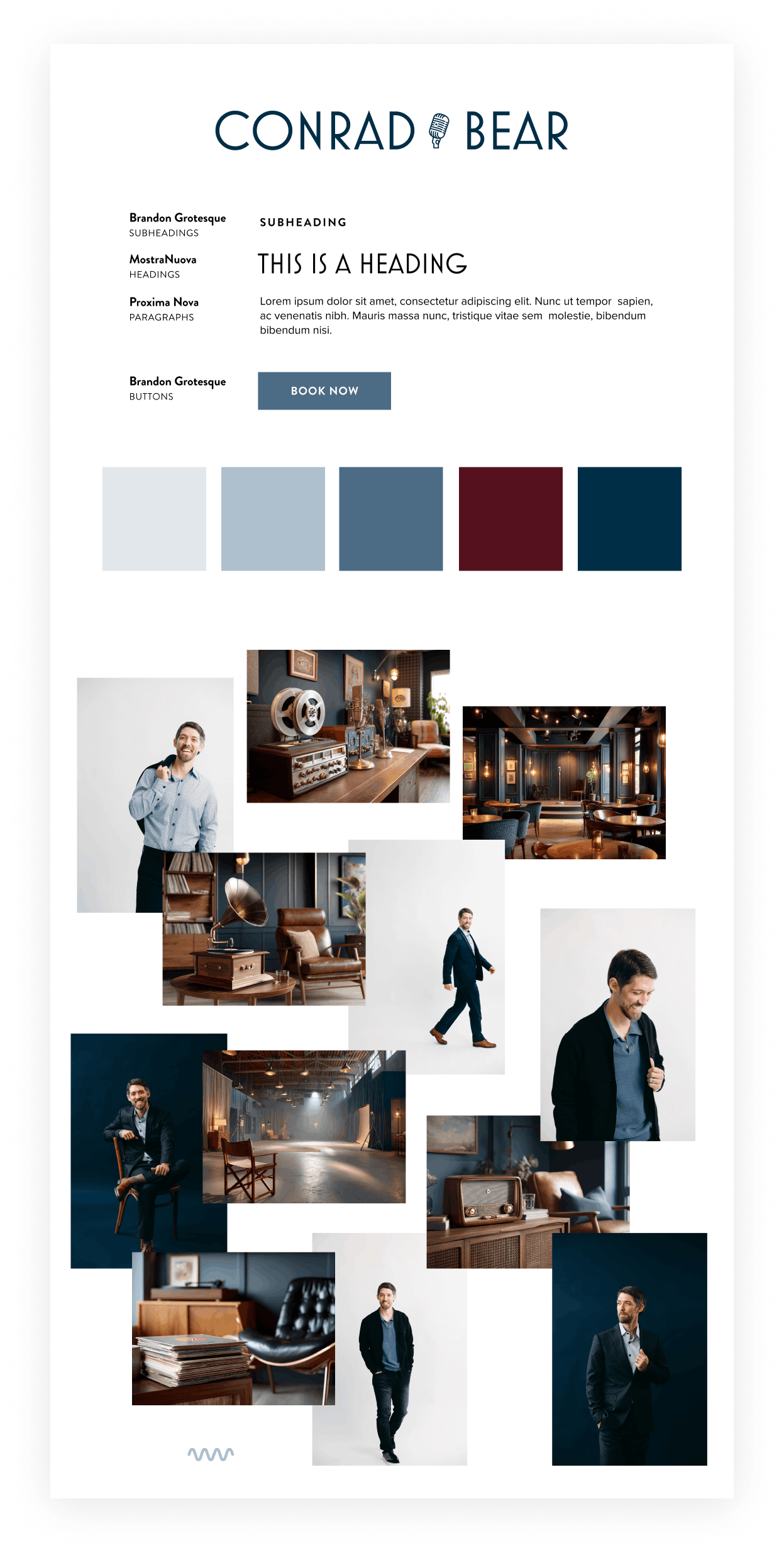
From there, everything flowed. The typography anchored the entire vibe — I chose MostraNuova, a font that immediately reads as classic and cinematic, and built his new logo around it, incorporating that vintage mic as a graphic element.
The color palette is cool blue and navy with rich burgundy accents: calm, confident, and a little bit dramatic in the best way. I also created custom visuals to complement his professional headshots and keep the aesthetic consistent throughout.
On the structural side, we made a deliberate decision to give each area of Conrad's work — on camera, on stage, and voice-over — its own dedicated page. No more hunting. Each one is easy to find, easy to explore, and ends with a clear call to action so booking him is easy.
One of my favorite details on the home page is an interactive section featuring one image per area of his expertise. Hover over it, and a content block appears — it's a sleek, engaging way to introduce visitors to the full range of what Conrad does without overwhelming them the moment they land on the site.
The Result
Conrad now has a website that finally matches his talent. It's polished, it's engaging, and it makes an immediate impression — the kind of first look that a performer at his level deserves.
The content is organized into digestible chunks, the navigation is intuitive, and every page is designed to keep visitors moving and ultimately reach out.
Now he has a website that he’s proud to share.
Scroll through the home page
Pin this post to Pinterest! 👇🏻