A Fresh Rebrand for a Thriving Church Orchestra Music E-Commerce Site
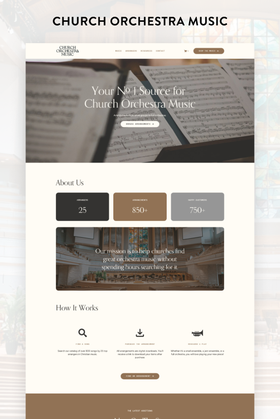
CHURCH ORCHESTRA MUSIC
Church Orchestra Music is a Squarespace e-commerce site selling digital sheet music arrangements for church orchestras. The site has been around since 2022 and has grown steadily year over year, with a roster of arrangers, a growing library of arrangements, and a loyal customer base of churches.
After a few years of solid growth, it was time for the site to catch up with where the business actually was.
The Problem
The original site did its job, but it was showing its age. The color palette had neutrals paired with a green accent that never quite clicked. The site was also light on imagery, which left it feeling flat and gave visitors less of a reason to stick around.
And practically speaking, the site was built before there was any real data to work with. No customer base to speak of, no testimonials worth featuring, no statistics to lean on.
A brand new site can only do so much. The real opportunity comes once you've been around long enough to have something to show for it.
THE SOLUTION
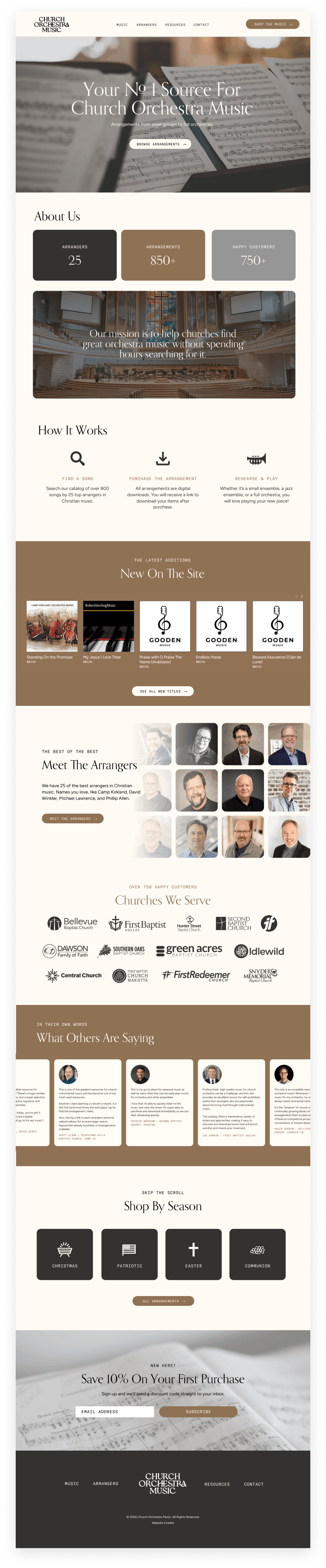
The first order of business was the color palette. The new palette is built around cream, black, and tan, with tan as the primary accent. It's warm and cohesive, and it gives the site a more polished, intentional feel.
The heading font, Orpheus Pro, carried over from the original site and still works beautifully. What changed was everything around it. GT America Mono was brought in for the subheadings and buttons. It has a distinctly different texture from the heading font, which draws the eye right where you want it: toward the buttons and calls to action. Figtree handles the paragraph copy and keeps things clean and easy to read throughout.
On the content side, the rebrand was an opportunity to add several sections that simply didn't exist before because the data wasn't there yet.
The home page now leads with statistics. This matters more than it might seem. Numbers do something that words alone can't. They establish credibility quickly and give a visitor an immediate sense of the scale and legitimacy of what they're looking at.
There's also a new section introducing the arrangers, built around a collage of their headshots. Our brains process images faster than text, so putting faces to names is a smart move for brand recognition.
The site now also features a logo wall of churches that are repeat customers. This is social proof in its simplest and most effective form. Seeing recognizable church names signals to a new visitor that this is a trusted resource, not a newcomer.
Testimonials got a full refresh as well. With years of customers now in the bank, there was finally enough to work with. I built an infinity carousel to display them, which keeps the section feeling alive and makes it easy to rotate through without the page feeling cluttered.
The last addition was a Shop by Season section featuring Christmas, Easter, Patriotic, and Communion. This is purely about user experience, and user experience is worth taking seriously. When someone lands on your site knowing exactly what they need, the fastest path to checkout is the best path. Making them dig for it is how you lose them. A simple seasonal shortcut removes that friction entirely.
It's also worth noting that the store runs on Squarespace's universal filter system, which lets shoppers sort and narrow down arrangements by whatever criteria matters to them. For a library this size, it's essential.
The Result
Church Orchestra Music now has a site that matches the business it has actually become. It's more polished, better organized, and packed with content that builds trust and drives sales.
If your site has been around for a few years and you haven't touched it since its launch, this is your sign. A brand new site can only do so much. But once you have history, customers, testimonials, and real data behind you, there's a lot of material to work with that didn't exist on day one. If you're ready to give your site the refresh it deserves, let’s talk.