Brand Implementation and Website Redesign for an Anglican Diocese
DIOCESE OF THE MID-ATLANTIC
The Diocese of the Mid-Atlantic, known as DOMA, is a regional diocese of the Anglican Church in North America. A couple of years ago I helped migrate their website from Squarespace 7.0 to 7.1, and when they reached out again a few months ago, I was very excited to work with them again. They are exactly the kind of client that makes this work fun.
DOMA’s bishop wanted branding that was unique to the diocese, so before they came to me, they worked with a marketing agency to develop a full branding package — logo, seal, colors, fonts, imagery direction, the whole thing. And it was gorgeous.
Investing in branding matters more than most people realize. Branding is something I build into every website project I take on. The fonts, the colors, the imagery style, the tone — all of it has to work together or the site falls apart visually no matter how well it's built.
So they had the branding. Now they needed someone to bring it to life on the website.
The Problem
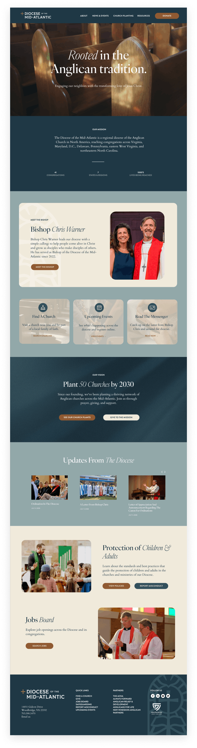
The old site wasn't doing them any favors. Most pages were essentially white backgrounds with text on them, closer to a Word document than a website. There was no color variation, no visual hierarchy, no consistency in the imagery.
The structure was also a problem. Information was scattered across multiple pages, so visitors had to click through several layers to find what they were looking for.
THE SOLUTION
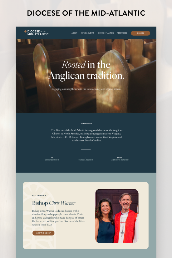
The new branding guide gave me everything I needed to build something that actually felt like DOMA. The color palette centers on three shades of blue and teal, which is calm and inviting in a way that suits a diocese well. The secondary accent colors are copper and linen. The combination works because the copper brings warmth and the linen brings airiness, and together they balance out the shades of blue.
For typography, Ivy Presto handles the headings. Mixing the italic and upright styles throughout the headings gives the page variation and keeps things from feeling monotonous. Cardo works alongside it as the body font, and the two fonts complement each other in a way that feels cohesive without being repetitive.
Figtree handles the subheadings and buttons, giving those elements a cleaner, more modern contrast against the serif pair.
On the structural side, the biggest improvement was consolidating the site's content. Where the old site spread information thin across multiple pages, the new site brings it all together. Visitors can find what they need without clicking through multiple pages. Consolidating related content onto single pages is also better for SEO because search engines reward pages that cover a topic thoroughly rather than fragmenting it across several thin pages.
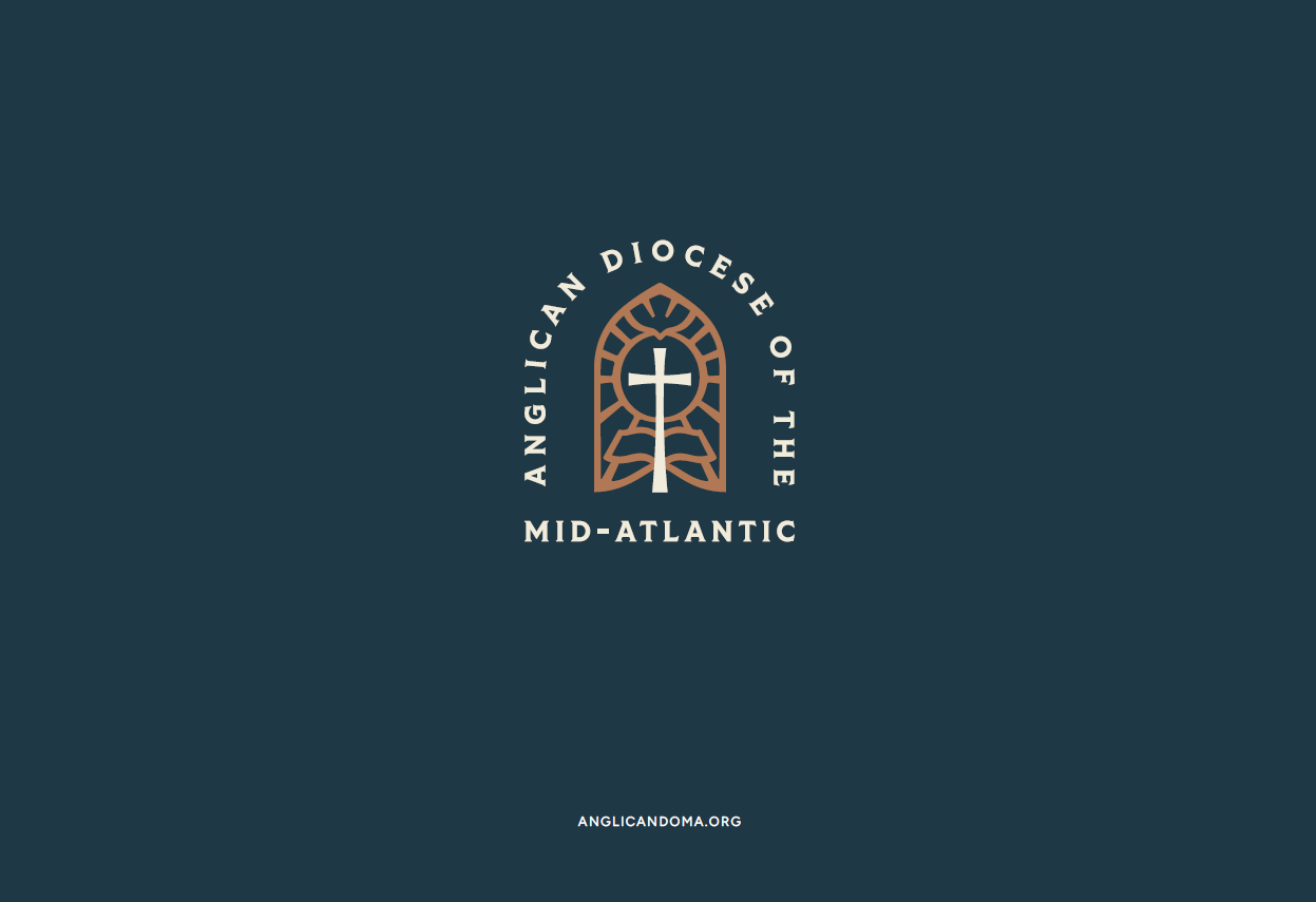
Graphically, the seal (below) tells you everything about the level of thought that went into this rebrand. It features a dove descending toward a cross set against an open Bible, framed by stained glass detailing and their full name around the edge. It's the kind of mark that takes real investment to create, and it's the kind of mark that no one else has (which is exactly the point).
The last addition was a Shop by Season section featuring Christmas, Easter, Patriotic, and Communion. This is purely about user experience, and user experience is worth taking seriously. When someone lands on your site knowing exactly what they need, the fastest path to checkout is the best path. Making them dig for it is how you lose them. A simple seasonal shortcut removes that friction entirely.
It's also worth noting that the store runs on Squarespace's universal filter system, which lets shoppers sort and narrow down arrangements by whatever criteria matters to them. For a library this size, it's essential.
The Result
DOMA now has a website that looks and feels like the diocese it represents. It's polished, it's organized, and it reflects the investment they made in their brand identity. The old site made people work for information. The new one puts everything where it should be and lets the visual identity do the talking.
Here’s what Heidi said about working together:
“Our old site was too cluttered. Too many unused, unnecessary pages that didn't reflect our new branding. Now that our new site is live, I love hearing positive feedback from everyone who sees it!
Working with Jessica allowed me to give attention to my actual job and not worry about learning new skills to transform the website. Jessica is kind, professional, efficient, talented, and I was so relieved to get to work with her again.”