Timeless and Elevated Website Refresh for a Legendary Church Music Arranger
CAMP KIRKLAND
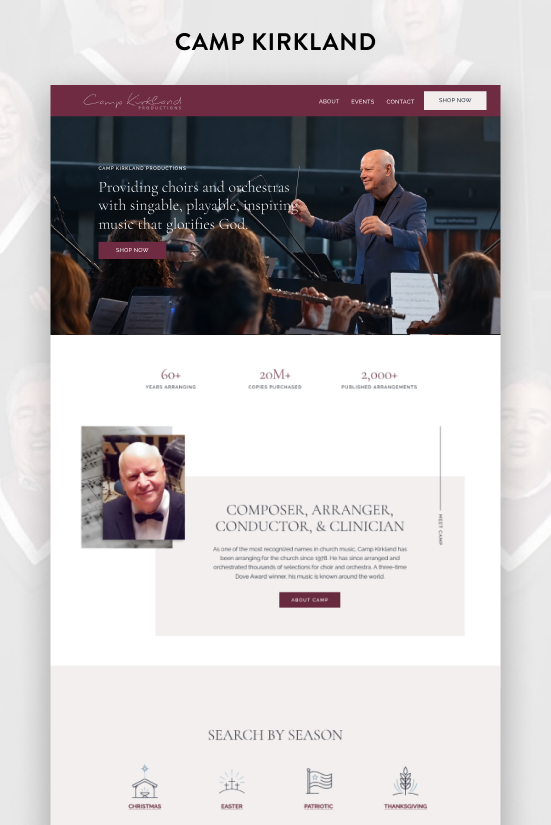
Camp Kirkland has been arranging music for the church for over 60 years. With more than 20 million copies sold and over 2,000 published arrangements to his name, he has left an undeniable mark on church music.
He's still actively arranging and leading music workshops today, and his website needed to reflect both the weight of that legacy and the fact that he isn't slowing down anytime soon.
The Problem
It had been four years since I previously designed Camp’s site, which was built on Squarespace's classic editor at a time when the tools were far more limited. Since then, Squarespace rolled out Fluid Engine and a whole new set of design capabilities that simply weren't available before.
The old site was dated, and not in a charming way. The design hadn't aged well, and it wasn't doing justice to someone with Camp's body of work. On top of the new Squarespace features, I had also grown significantly as a designer in those four years, so I had a lot more to bring to the table as well.
THE SOLUTION
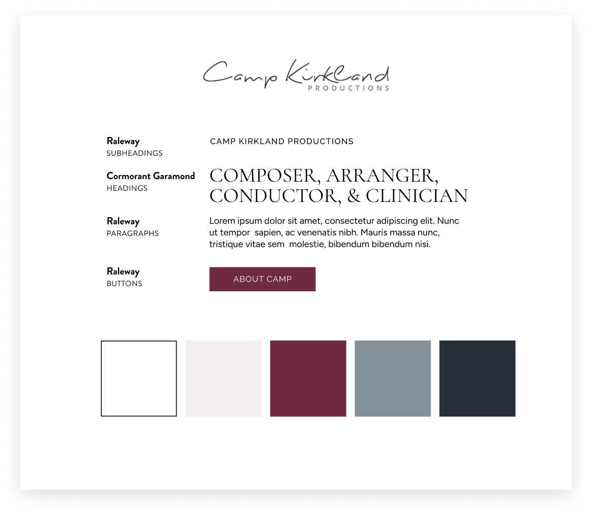
The color palette stayed exactly as it was: deep navy, slate blue-grey, a rich wine, and a soft off-white cream. It's a sophisticated combination and there was no reason to touch it.
What did change was the typography. I swapped the heading font for Cormorant Garamond set in all caps, and it immediately elevated the feel of the entire site. Raleway handles the body copy and buttons, keeping things clean and legible alongside the more editorial heading font.
The home page opens with a short video clip of Camp conducting an orchestra, and that was a deliberate choice. Video in a hero section does something a static image can't. It catches the eye immediately, it's engaging from the first second, and in Camp's case it sends a message that this is someone who has been doing this for a long time and is still very much at it.
Right below that are the statistics. Over 20 million copies sold. Over 2,000 arrangements published. Numbers like that do the heavy lifting that paragraphs of copy never can. They establish the scale of what he's accomplished instantly and give a visitor an immediate sense of who they're dealing with.
The About page features a vertical timeline that spans six decades of his career. I included photos throughout the years so visitors can see how Camp and his work have evolved over time.
The new site also takes full advantage of several features Squarespace has recently rolled out that previously required custom code or weren't possible at all. Vertical lines with vertical text appear throughout the site as a design element. It adds visual sophistication without screaming for attention, which is the right way to use it.
The testimonials section on the home page uses Squarespace's sticky feature, where the heading on the left stays fixed in place while the testimonials on the right scroll past it. It's a sleek, modern layout that keeps the section feeling dynamic without being distracting. I also used custom code to create a parallax scrolling effect on one of the background sections, where the background image moves at a different rate than the content in front of it. It's a subtle effect that adds depth to the page and breaks up what could otherwise feel flat.
Also, on the About page timeline, hovering over the photos causes them to expand, which adds a layer of interactivity that keeps the page from feeling static. It's a small detail that rewards curiosity and makes the browsing experience feel a little more alive.
The Result
Camp Kirkland now has a website that finally matches the scope of his career. It's polished, it's engaging, and it uses the best of what Squarespace can do today rather than what it could do four years ago.
His legacy is front and center, his statistics speak for themselves, and the site makes it clear that someone with 60 years behind him is still going strong.
Here’s what CAMP said about working together:
“My site is now flourishing with eye catching graphics, comments, testimonials and SALES! I love it and Jessica has all of the tools and gifts needed to open new doors for me.
Jessica is highly qualified, talented, helpful, encouraging and creates top notch sites that will stimulate people who visit and definitely encourage them to turn into customers.”