Stop the Scroll: How to Write Headlines and CTAs That Actually Work
Pin this post to Pinterest! ☝🏻
Ever landed on a website and thought, “Cool, but… what am I supposed to do here?” That’s the power (or failure) of a headline and call to action.
Your headline is your first impression. Your CTA (call to action) is the signpost that tells people where to go next. And if either one is confusing, vague, or missing altogether? You’re basically asking your visitors to wander around and maybe figure it out.
Spoiler: They won’t.
Let’s fix that.
Why Your Headline + CTA Are Secretly Running the Show
You’ve got about 5 seconds to make someone care. That first headline needs to do two things:
Tell people they’re in the right place
Make them want to keep reading
Your CTA is what turns curiosity into action. It's how someone books a call, downloads your freebie, or finally buys that thing they've had open in a tab for three weeks.
And yet — so many Squarespace sites are missing the mark. Gorgeous photos. Creative color palettes. But almost zero CTA buttons. (which isn’t helpful 🙂)
What Makes a Headline Work (and Why Clever Isn’t Always Better)
We love a witty phrase… but if no one gets it? It’s just noise.
Great headlines are:
Clear, not cute – Say what you do and who it’s for.
Problem-focused – Touch on the pain or desire your visitor feels.
Simple and skimmable – Aim for 8–12 words max.
Helpful, not hypey – Avoid buzzwords. Speak like a human.
Here’s an example:
“Websites that work hard, so you don’t have to.”
vs.
“Creative digital studio for bold brands ready to grow.”
The second one sounds pretty, but what does it mean? If you confuse, you’ll lose. Be clear. Use simple words that people can easily understand.
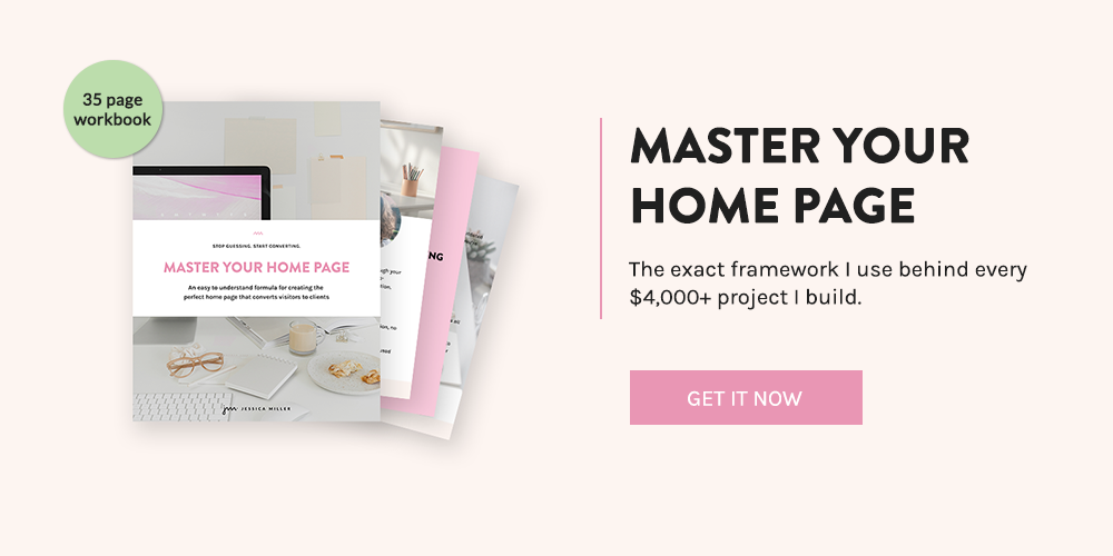
If you need help building a headline that actually connects, the first section of my Master Your Home Page guide walks you through it step-by-step. No guesswork, just clarity.

What to Say in Your CTA (Hint: Not “Learn More”)
Your CTA is the bridge between interest and action. But most people treat it like an afterthought. (“Sure, let’s just throw a ‘submit’ button on there. That’ll convert!”)
Let’s upgrade that, shall we?
Good CTAs are:
Actionable – Use verbs: “Get,” “Start,” “Grab,” “Book”
Specific – Tell them what they’re getting
Benefit-driven – Focus on what’s in it for them
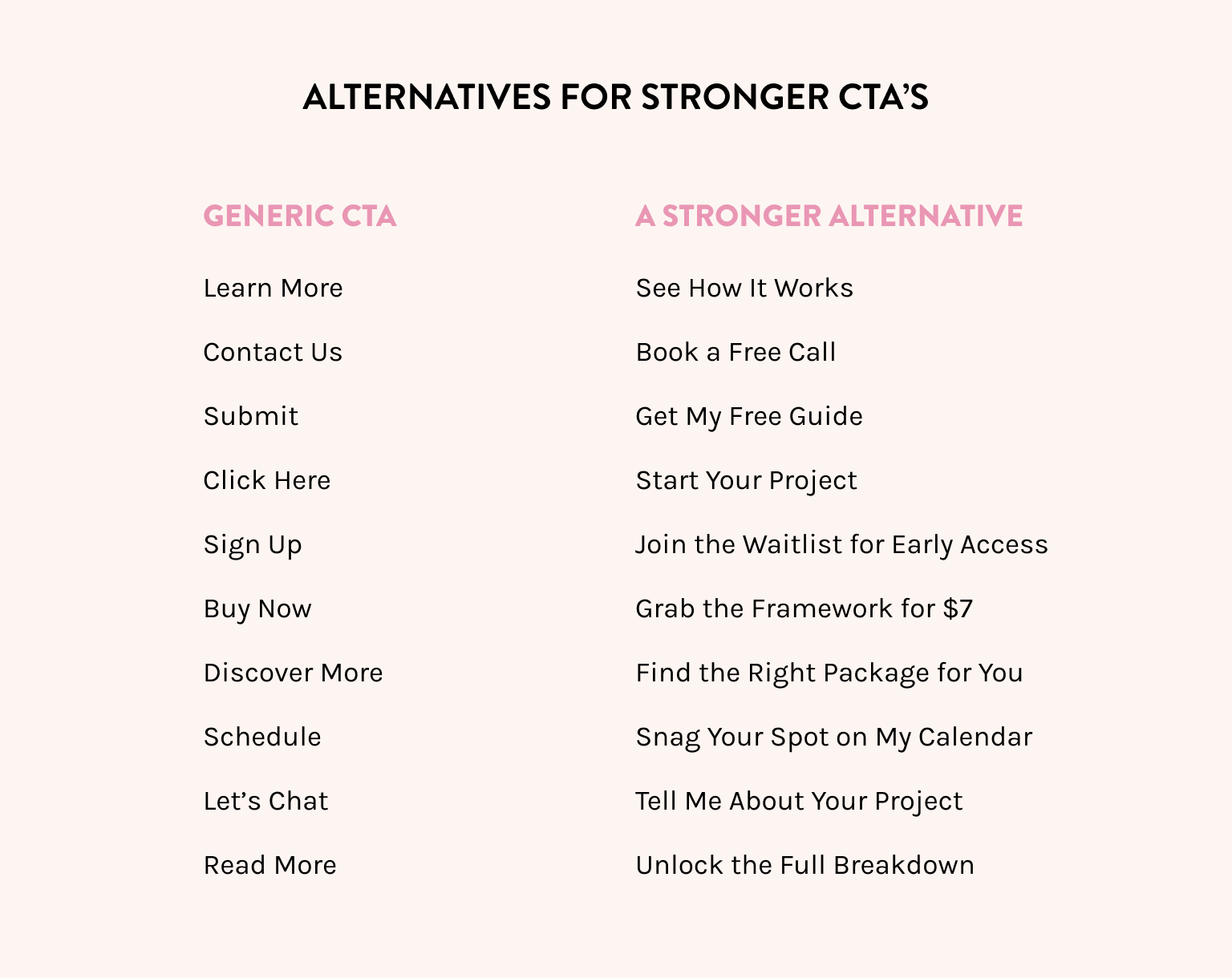
Instead of “Learn more,” try These:
“See how it works”
“Download the free guide”
“Start your Squarespace site the right way”
PRO TIP: Most websites don’t have enough CTAs. You need more than one. A good rule of thumb is:
Every scroll section on your home page should include a CTA. That’s usually 4–6 buttons total. Think of them as little reminders: “Hey, want to do the thing?” I also make sure I include a CTA at the bottom of the page so that they have an action to take once they’ve read the whole page.
Common Mistakes (And How to Avoid Them)
Let’s talk about headline + CTA blunders I see all the time:
1. Vague, fluffy headlines: If your headline could be describing any business in any industry, it needs to be tweaked.
2. Talking all about you: If your site says “I help amazing clients bring their vision to life” … that’s nice. But it doesn’t turn people into clients.
3. Only one CTA (at the very bottom): Most visitors don’t scroll that far, so don’t make them hunt.
4. Overwhelming with too many options: Give one clear action per section. Your page shouldn’t be a Choose Your Own Adventure.
Need help organizing your sections and getting your CTA placement right? The Master Your Home Page guide specifically walks you through that — including the order your sections should go in and where each CTA should live.
What to Do When You’re Stuck (Because Copywriting Is Hard)
Writing the text for your own website is like trying to give yourself a haircut in a mirror. Backwards. In the dark.
Here’s how to un-stick yourself:
Go back to the problem you solve. What’s your visitor frustrated with? Start there.
Use real words from your people. Pull language from emails, reviews, DM convos — it’s copy gold.
Don’t write, just speak. Record yourself explaining what you do. Transcribe it. Clean it up.
Sleep on it. Truly. You’ll hate it less in the morning.
Want More Help? Start With This.
If your Squarespace site looks good but isn’t converting — it’s probably your home page. That’s where most people decide to bounce or stay.
Master Your Home Page shows you:
What sections to include (and why)
Exactly what to write in each one
My proven Squarespace strategy for a conversion-friendly layout
…and yes, how to finally write that headline and CTA.
*This post may contain affiliate links, so I may earn a small commission when you make a purchase through links on this site at no additional cost to you.